Checkout in an online store is a place that anyone who wants to make a purchase will encounter. That’s why there’s no room for any mistakes here – because you pay for checkout mistakes with an abandoned shopping cart. What to keep in mind when creating a checkout? Read and benefit!
Steps to checkout an online store that sells
Here are some universal rules for effective checkout in an online store:
- The customer sees a summary of the order directly after buying.
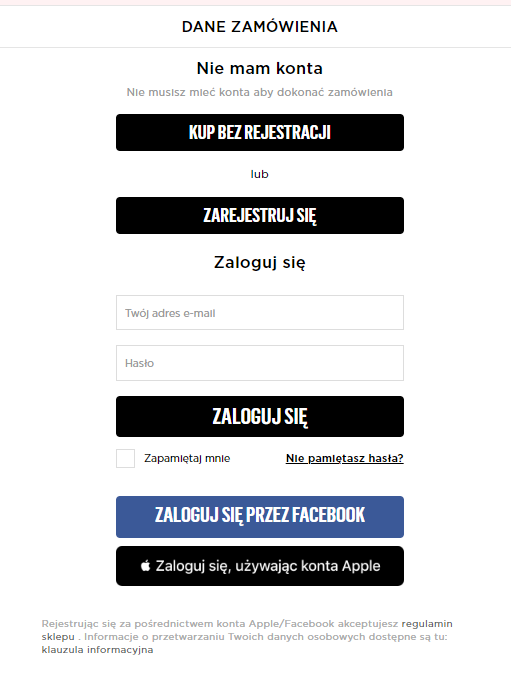
- The customer decides how he or she will make a purchase – offer different options: purchase without registration, with registration or login via Facebook. What might this look like?

- The customer knows at what stage of the purchase he or she is at – make sure to provide feedback to the customer – such as with a progress bar.
- It is easy for the customer to quickly contact the store for any assistance during the shopping process – all that is needed is a phone number or e-mail.
- The customer can easily access the terms and conditions and privacy policy.
- The checkout does not include outbound links – to avoid distracting the customer.
- The form, when filled out incorrectly, does not tell you to complete all the fields from the beginning, but communicates where to make the correction.
- On the checkout side, and before the page Thank You Page an upsell step appears, where the customer can add more recommended products to the cart.

- A customer who returns to the store and has previously registered can log in and does not have to fill in the fields again with the data needed to complete the purchase.
- The registration process itself is easy, not burdened by requirements, for example, against the level of password complexity. Password recovery itself is also fast.
- Input fields contain suggestions e.g. with input information contain suggestions e.g. with email to charge the customer.
- First, an email address is taken from the customer so that they can be contacted again if necessary.
Gotowy na rozwój?
Checkout in an online store – customization for mobile devices
Let’s remember that mobile devices account for an increasing share of the e-commerce market, but as experience and statistics show, it is the users who visit online stores via smartphones and tablets who most often abandon their shopping carts. In order to properly take care of these customers and increase your chances of completing the transaction, it is worth paying special attention to:
- maximum limitation of the number of fields to be completed – ask only for the information that is necessary to complete the purchase process, for example, the date of birth can be forgiven;
- intuitiveness – checkout in an online store should be simple, even more so on mobile devices, where it is more difficult to move between fields and options;
- Since we’re talking about fields in the form – they should be large enough to make selecting them on a small screen convenient enough not to scare away the customer;
- navigation bar – its appropriate design, for example, in the form of indicating the stage of purchase finalization, which informs the user how many more steps are waiting for him to complete all the steps. Such a navigation bar, also called mobile checkout, is the most convenient for users.
Summary
Checkout in an online store is one of the elements of the shopping process, and like all others, it requires perfect refinement to effectively bring customers to the completion of the transaction.
Need support in fine-tuning any of the stages of the purchasing process – I can help with that. I advise online stores on what to do to make more money, and I have the technical background to work out the details that are needed to make that money. Feel free to contact me.


