Wondering how to open an online store that will sell? Do you want to work in e-commerce? Since the pandemic, the number of stores is growing rapidly, so you have to expect competition. I’ve put together a checklist of 10 elements to get you off to a higher level in e-commerce right away.
UX design
UX, or user experience, is fundamental if you want to sell. The store must be intuitive, the ground is to make it comfortable to use. I recommend first of all to pay attention to:
1.Charging time
A slow-loading website is the best way to scare a customer away at the start. The charging time should be <5 seconds.
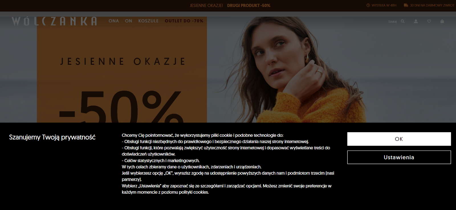
2.Cookie notifications
We’re already used to cookie notifications, but it’s a good idea to make sure the pop-up isn’t too annoying for customers. The notification should be easy to close.
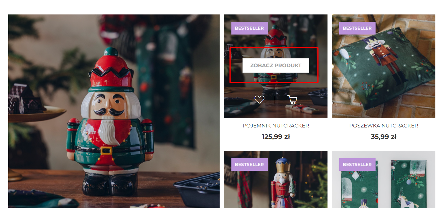
3.Buttons on the page
Elements that are clickable should stand out in color. You can also use the so-called. hovers – then the button changes its appearance when the user hovers over it with the cursor. If you include links on the page, anchors should be bold and/or underlined. Non-clickable elements must not resemble buttons so as not to confuse the user.
4.Store logo
The logo on each subpage should be in the same place. It’s also good if clicking on the logo takes you back to the home page.
5.Pop-ups
I’m not saying that pop-ups are inherently bad, but you have to use them well. First, they should be easy to close, and second, they must not appear too early (at least several seconds after opening the page). Creating online stores requires sensitivity, but also analysis. To see how users behave on your site, you can use tools such as. HotJar .
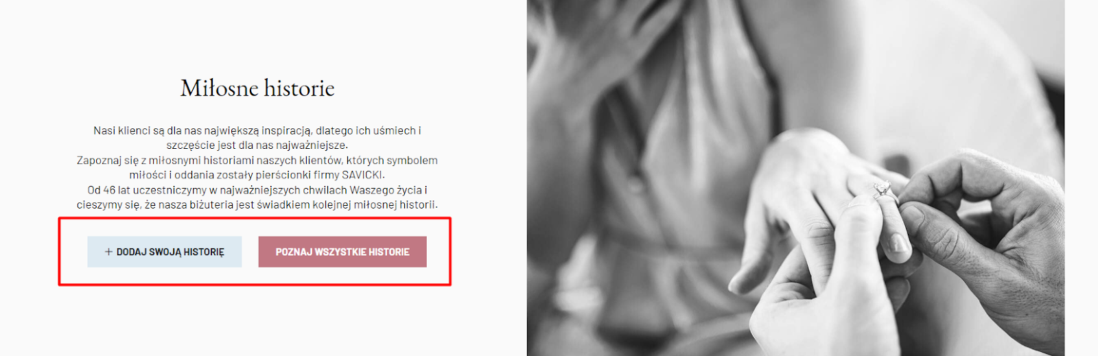
6.CTA
It’s a good idea to put a CTA on every subpage, even a 404 error page, in blog posts or a page showing no search results for a given query in the search engine . Ideally, the CTA text should always start with a verb: Contact, Buy Now, Buy, etc. (rather than Contact, Save, etc.). As seen below, CTAs can also be used to create an engaged community around a brand:
7.Menu
The menu of an online store should show all the most important categories and be clearly visible, for example, through strong colors.
Purchasing process
The appearance of the store itself is just the beginning, in the end you are concerned with selling a product. See 3 things to keep in mind when creating and analyzing a purchase path:
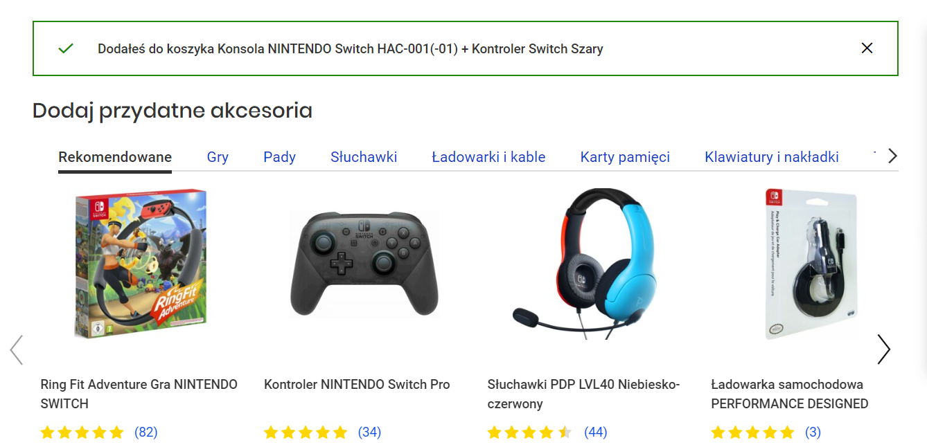
8.Up-selling and cross-selling
It pays to offer the customer complementary products or higher-priced products with additional features for greater convenience. This increases the chance that a customer will leave more money with you. The masters of cross-selling are primarily electromarkets:
9.Home page
For some products (especially more expensive ones purchased once every few years), the purchasing process can be quite lengthy. Already on the homepage so it pays to put information about, for example, a limited-time promotion. Also, don’t forget to write from what amount you offer free shipping or encourage the purchase of bestsellers. In this way, you increase the chance that the customer will spend more time on the site, start browsing products, etc., and decide to make a purchase today.
10.Wishlist
Many Polish stores still don’t offer clear, convenient wishlists, and this is an easy way to gain customers and then guide them through the stages of the sales funnel. You can also use the Wishlist, for example. to inform the customer about a promotion on a product they are interested in or low stocks (last chance to buy).
These are just 10 tips, but if you keep them in mind, you’ll avoid some mistakes often made by beginners. Want to get really serious about e-commerce? Contact me for a course on creating an online store to help you at every stage of e-commerce ditching.