
If you want to sell over the Internet, you need to make sure that your online store is customer-friendly. Therefore, the issue of the UX of an online store should be a basic one that you will already know when designing a website. I present another of the elements relevant to the experience of a customer who wants to shop online. Read the article and learn why online store navigation is one of the most important design parts of a website, and how to do it well.
UX of an online store – what is it and why is it important?
User Experience, or just UX, refers to the user experience created through contact with a product. Following this line of thought, we can say that the UX of an online store is the impressions a customer of your online store gets while in the site online. For e-commerce, the UX of an online store is of great importance, as it affects the effectiveness of the store and the level of conversions your business can achieve.
You should care first and foremost about building positive experiences and impressions on customers who are willing to stay and buy in good stores. Good ones, that is, ones that are transparent and easy to use. The idea is that the customer at each stage of the shopping process should be able to easily find the product he is interested in, quickly get to the shopping cart and have a choice in delivery or payment options. These elements, above all, determine whether they will stay and purchase from you, or whether they will be discouraged and move on to seek a more positive experience from a competitor.
Good navigation in an online store, or what kind of navigation?
Navigation in an online store is very important, as it is one of the key elements responsible for the friendliness and usability for the store’s customers. It is with the navigation of the online store that virtually every customer interacts, and it is the navigation that determines whether the customer will find it easy to navigate through our online store. That’s why good navigation design on a website or store is fundamental:
- influences the purchasing process – facilitates or disrupts it;
- helps customers reach their intended destination – a product or information;
- If it’s bad it can discourage and deter customers;
- can increase or decrease conversions.
How should an online store’s navigation look and function?
Navigation design
The navigation system can be described as broad and shallow, meaning that many items are visible at the menu level. This is a better option than creating a deep – multi-level menu.
The navigation elements are organized in a logical and preferably task-oriented manner.
The customer always has easy access to the home page, main categories, shopping cart and search box – as in a sticky navigation that “sticks” to users and is always available in close proximity as they scroll.
The main navigation does not contain unnecessary links – such as terms and conditions, privacy policy or returns.
Information in navigation
Navigation provides feedback to the user, i.e., for example, it shows the active state in which the user is currently on the site.
Category labels accurately describe the information on the page.
Less relevant corporate information can be found at the bottom of the page.
Navigation in an online store – good practices
There are at least a few treatments that are already so familiar to online store customers that they simply work well. Learn some of the best practices involved in creating an online store navigation:
- The most popular menu, the hamburger menu. It gets its funny name from an icon in the form of three horizontal lines, which are just associated with a hamburger. The contents of the menu are hidden in a side, pull-out panel. It works especially well with mobile devices.
- Horizontal menu. Most effective for sites with versions for desktop devices. It provides quick access to subpages of the site, but requires a lot of space to present categories or subpages horizontally side by side.
- Sticky menu. It can be said that it “sticks” to the user of the page and, even when scrolling, is always easily accessible. It is worth including such elements as a shopping cart and a search box.
- CTA . It’s worth using Call To Action because it helps to quickly move the user to a place of interest – to read more information about the product or go directly to the shopping cart.
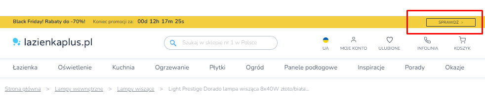
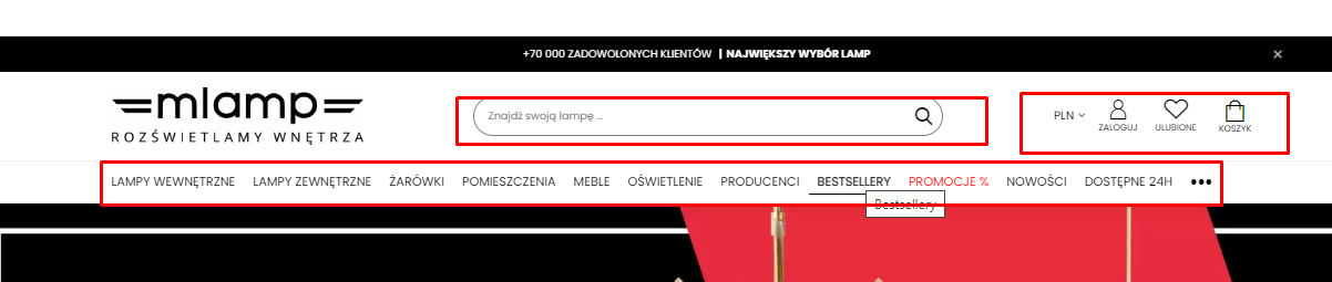
examples of good menu design and location
source: mlamp.pl and lazienkaplus.pl
Summary
The navigation of the online store must follow the good UX practices of the online store. Only such will positively affect the effectiveness of your online store, including conversion. If you need support in refining the UX of your online store – get back to me. I will help increase conversion and profits in your business.


