A banner ad appears on virtually every website – it can present information about a special offer, encourage customers to buy seasonal products or present a new collection. The mere fact that you create a banner for a website, however, does not do much – the so-called “banner” comes into play here. banner blindness. So how do you create a banner that won’t be a waste of time and space on your website?
Banner blindness – what is it?
Banner blindness (banner blindness) is simply getting used to ads, which makes us automatically ignore them. Banners are some of the oldest ads, appearing on the Internet since the 1990s. Initially, they were very effective, but over time (due to advertisers’ mistakes!) their effectiveness has greatly diminished, especially since most banners are illegible, bright, and in general – annoying rather than useful to the viewer. But should this mean that it is better to abandon banners altogether? Of course not! It is simply worth it to ensure their high quality.
Features of a good advertising banner
The most important thing is to avoid the mistakes that led to banner blindness. The banner is located in such a place that it catches the eyes of the audience anyway , so it is better to exercise restraint when designing it.
CTA
Call to action, or a call to action, is the cornerstone. The customer should know what to do. The best bet is one word: Check, Order, Buy or a short phrase: Buy Now, Register, See More. This immediately suggests to the user that they can click the banner to move on.
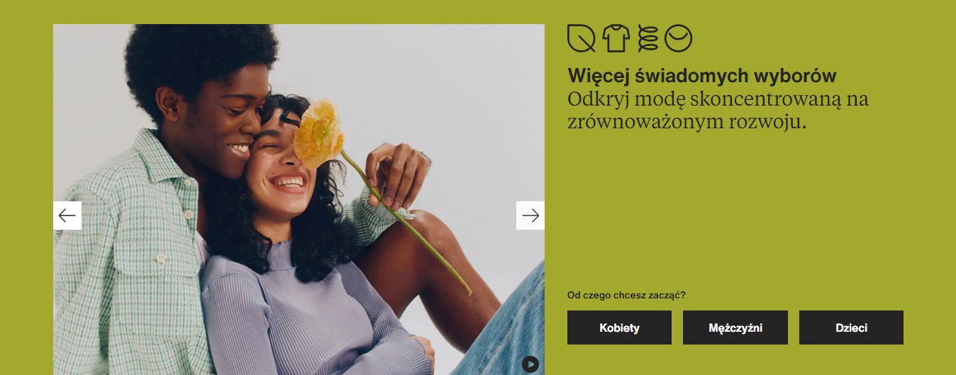
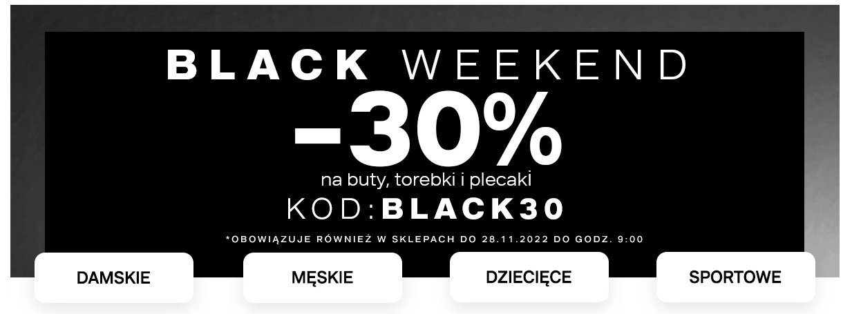
Some apparel brands do not use traditional CTAs, but instead immediately direct to the category:
Readability
A common mistake is to put too many elements on the banner, making it no longer readable. Keep the number of words to a minimum, avoid combinations of multiple colors, and opt for simple, aesthetically pleasing graphics. It is better to give up bright colors – the effect is counterproductive. Pastels, beige, black or white work well. You don’t need to have outstanding graphic design skills, but remember above all proportions and equal margins. When you insert a clear, minimalist banner, the website will sell more effectively.
Below I have inserted an example of a very simple banner that conveys everything a customer needs to know. For Black Friday, the black color scheme is even a must – customers are already used to it. The same is true of Christmas, when red and gold rule.
Language of benefits
OK, the less text on the banner the better, but if you do put it up, it should communicate the benefits to the customer. After all, why should he take advantage of your offer, and right now? Maybe you’re offering free shipping, sewing clothes in the spirit of slow fashion, gift wrapping or launching a limited collection. Generalities like: cheap, fashionable, etc. have not worked for a long time. Think about what you can convince the customer not to look further, but to buy just from you.
The biggest mistakes when creating banners
Although the website banner is such an old form of advertising, some people still do not fully exploit its possibilities. Personally, some of the biggest “sins” when creating banners include:
- No CTA button (or a poorly visible call to action),
- Lack of responsiveness (the banner does not adapt to devices with different resolutions),
- Lack of redirection to the appropriate sub-page after clicking the banner,
- long loading banner.
How to create a banner yourself?
Many budding entrepreneurs do not want to invest in a graphic designer, hence the decision to create the banner themselves. If you have a basic aesthetic sense you can handle this, for example, using Canva. Just go to Templates and search for Banner. Here you will find a lot of ready-made templates that you can customize for your site by replacing graphics, changing colors or fonts. If you are creating a banner for a website, the dimensions can vary. Indicatively, a banner of 1180×450 px is often placed in the header of the page. In Canva it is possible to download the banner in different sizes, so it will also work well for Facebook, for example.
Do you want to create a really good website banner or Google Ads banner ads? Contact me – me and my team will help you to catch the attention of your customers, and at the same time not to burden the site.