In today’s world, where online competition is increasingly fierce, effective website navigation plays a key role. As a site owner or designer, you’re probably wondering what menu to choose to improve the user experience. In this article, we’ll take a look at the different types of menus on websites and discover what the best practices are for designing the perfect menu.
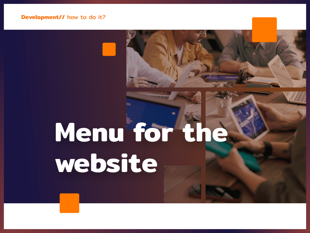
Menus on a website – a key part of UX
Menus on a website play a key role in user interaction with content. It is a virtual command center for finding your way through the maze of information. Choosing the right menu has a huge impact on user satisfaction and site effectiveness.
Types of menus on websites
Horizontal Menu:
- Placed usually at the top of the page.
- It often includes major categories.
- Aesthetically pleasing and easy on the eyes.

Vertical Menu:
- Located usually on the left or right side.
- Ideal for sites with multiple pages.
- Facilitates content scanning.

Pull-out menu:
- Appearing when you hover the mouse or touch the screen.
- Saves space on the page.
- Modern and dynamic.

Menu mega:
- An extensive menu with many options.
- It often includes images and descriptions.
- Perfect for large e-commerce sites.

Icon menu:
- It consists of icons representing categories.
- Minimalist and modern.
- Ideal for mobile sites.
Key elements of an effective menu
- Clarity: Categories should be clearly labeled. Also avoid overly dense content.
- Responsiveness: Adapt your menu to different devices. Provide easy navigation on smartphones and tablets.
- Search Engine: Add a search function for quick access. This will make it easier for users to find specific content.
- Colors and contrast: Choose colors in line with your corporate identity. Use contrasting colors for readability.
- Minimalism: Limit the number of options so as not to overwhelm users. Focus on the most important categories.
Excellent menu design practices
- Usability Testing:
- Conduct user testing.
- Gather feedback on the ease of navigation.
- Statistics analysis:
- Use tools to analyze site traffic.
- Check which categories are most visited.
- Optimization for SEO:
- Give category names appropriate, understandable titles.
- Make it easy for users and search engines to understand the structure of your site.
Menu personalization
Strive to deliver personalized experiences. Consider using tools that allow users to customize menus according to their preferences. Offer options to customize the order of categories or select favorite sections, increasing the personalization of interactions.
Menus on the mobile site
Remember that when it comes to menus, a website displayed on a smartphone will present them differently than on a large computer monitor. Therefore, ensure responsiveness on mobile devices, which are increasingly the main medium for accessing the Internet. Consider using a hamburger-type menu to save screen space. Optimize the size and ease of access to individual menu items on small screens.
Transparency and privacy policy
Place links to the privacy policy and cookie information prominently in the menu. Provide clear information on data processing, which will increase user confidence. Provide options to manage privacy preferences so that users have full control over their data.In summary, creating a great menu on a website is a dynamic process that requires consideration of a variety of factors. Personalization, responsiveness on mobile devices and transparency on privacy issues are key elements that will make navigation more intuitive and satisfying for users. That’s why it makes sense to invest time and resources in menu design to offer users not only information, but also an exceptional online experience.


