The most important element of any online store, right next to the product sheet, is the shopping cart. Its proper optimization should prevent so-called shopping cart abandonment, which is estimated to be committed by up to 70% of customers who have already selected products, but ultimately abandon their purchases. So how do you create a good e-commerce shopping cart? How do you minimize abandoned shopping carts? Let’s take a look at what to do so that you don’t lose potential customers as early as the stage when they throw their products into the virtual cart.
Online shopping cart
A virtual shopping cart contains the products that a customer has selected in an online store, but there are still some steps that such a customer has to go through between selecting the items and finalizing the transaction. They can be characterized by varying degrees of complexity, depending on the industry. Nevertheless, in any case when it comes to the shopping cart, the online store should remember to limit distractions and ensure the transparency of the data presented. It is important to avoid unnecessary elements that can make the customer distracted and, however, abandon the purchase. Distractions are, for example, advertisements and even the page footer or menu links. It is pointed out that a simple shopping cart, showing only the products and “back” and “next” buttons, works best, so that the customer naturally simply views the next pages of the transaction step by step.
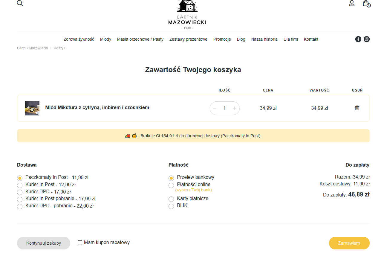
1 Simple shopping cart in the online store bartnikmazowiecki.pl
In terms of data transparency, avoid hidden costs – the suggested shipping cost should be in plain sight at the very beginning, so the customer will know how much he will pay completely for his purchases. In addition, it is a good idea to create a field for entering a discount code and hide it if we don’t happen to have any promotion open. Otherwise, the customer will go to Google to find the code, and if there isn’t one, they may then abandon the purchase.
What fields should an online store’s shopping cart still contain?
In addition to the basic fields in the form of information about the product (such as its name, photo, selected variant (color, size), price and quantity – which can be changed by the customer), it is advisable to display so-called shortage triggers, informing that only a certain small amount of a given item is in stock. This is because it can motivate the customer to make a purchase faster so that no one gets ahead of them. When creating a shopping cart, an online store can also use urgency triggers – which notify the customer that they have reserved items for a specific time (e.g., 10 minutes) or that by ordering by a specific time, they can expect same-day shipping. These types of items can reduce abandoned shopping carts.
What else has a positive impact on reducing the frequency of abandoned shopping carts? For example, free delivery from a certain amount – the information about the threshold should be clearly visible, and the achievement of a certain amount should be clearly highlighted (for example, by bold and green color). When determining the threshold, think about making it achievable (i.e., a different threshold will be good for a small accessories store and another for a clothing store). The threshold can be calculated by averaging the amounts of orders made. If on average customers spend £130 in your store – the threshold for free delivery may be £145.
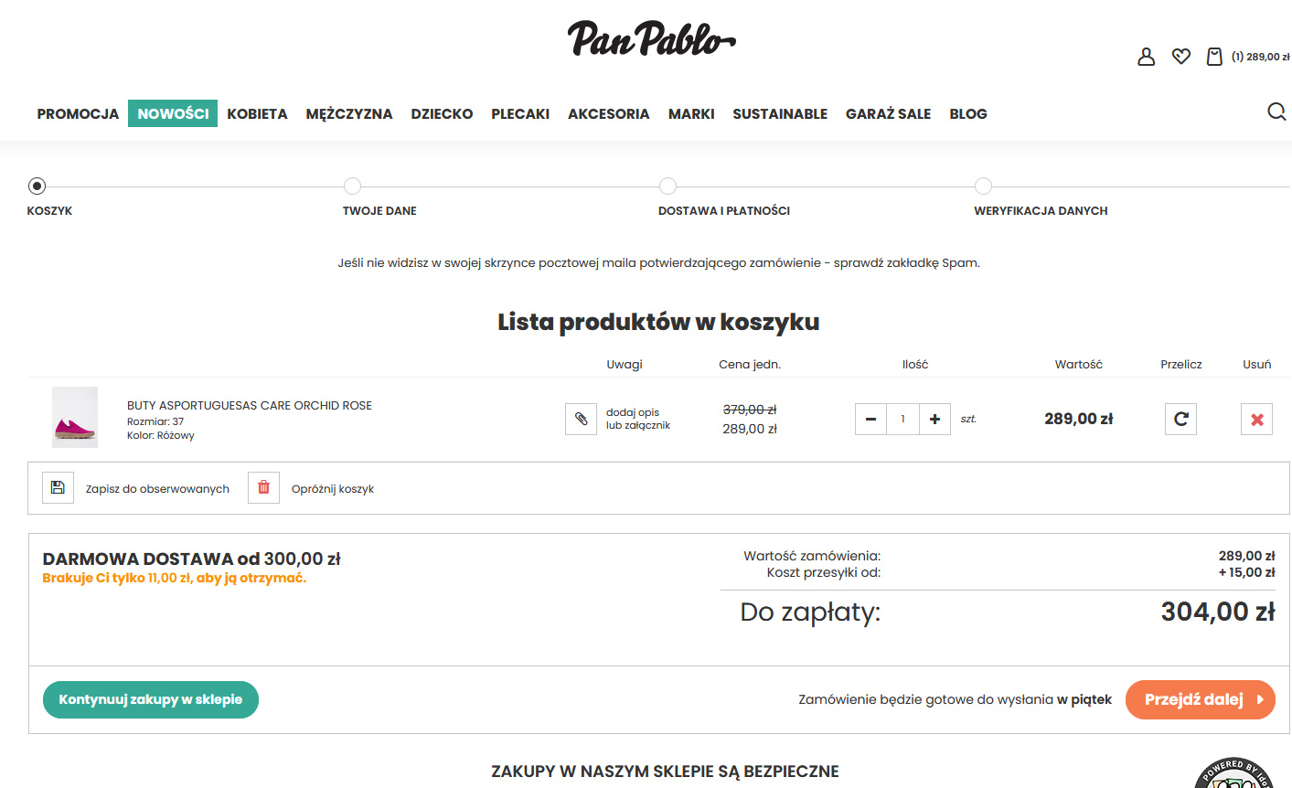
2 Free delivery threshold in panpablo.co.uk online store
The shopping cart – clear and easy to read – should include two CTA buttons: “continue shopping” and “proceed to checkout.” While wandering around the store, the customer should all the time have products in the shopping cart that he or she has previously placed there, but be aware of the option to easily remove items from the cart (the customer can choose another product and abandon the previous one). The option to save the shopping cart “for later” (when the customer returns to the site) is also recommended for use if you are creating a store in accordance with UX.
Checkout of an online store – what to remember?
The final step in the purchasing process is checkout. The customer then enters his information in the shipping form, approves the order and makes payment. It seems that at this stage, no one will be frowned upon anymore, but even then, abandoned baskets happen. How to level them? It is a good idea to divide the checkout into individual steps so that the customer knows in advance “how far away the end is.” Some online stores use the so-called one step checkout, that is, they put all the steps to be completed next to each other (without having to click “next” and thus move to the next step). Others choose the “classic” solution. However, what should be kept in mind in both cases?
Important are:
– The ability to make purchases without creating a customer account,
– Clear choice of delivery methods,
– clear choice of secure payment method.
Some potential customers, seeing the need to log in to make a purchase – simply leave the site in question and abandon the shopping cart. So it is worthwhile to present the Internet user with three options – logging in, creating a new account and making purchases as a guest. With this middle option, it is useful to list the benefits of registration. Often online stores offer an attractive discount, for example.
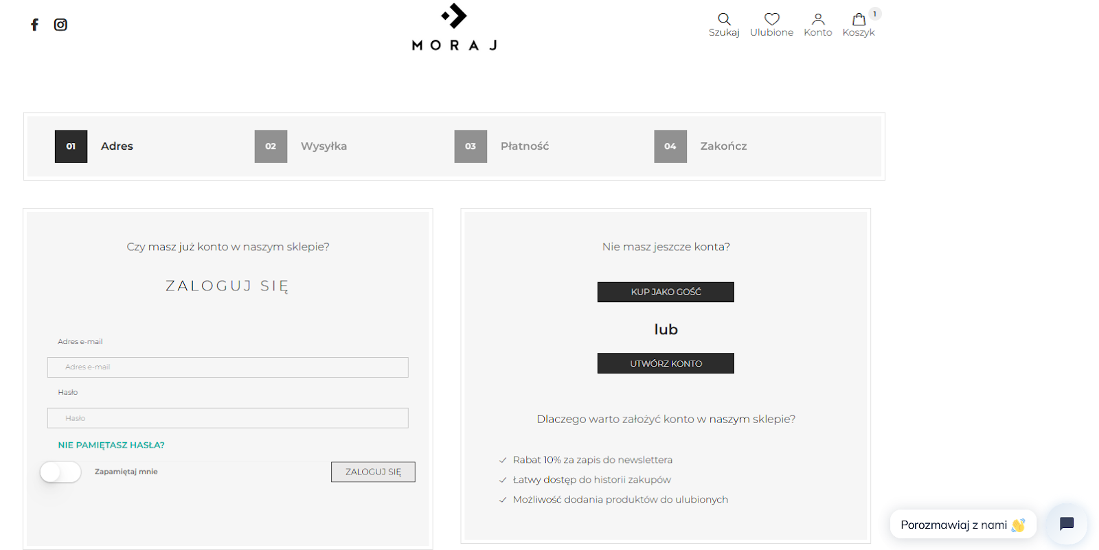
3 Moraj online store login/registration/guest options
As for the method of delivery, it should include as many options as possible, so that each customer can choose the form they happen to prefer. The most popular at the moment are parcel machines, but many people still use courier or postal shipping. Delivery prices should be as low as possible, and it is a good idea to indicate with each option what day delivery is expected.
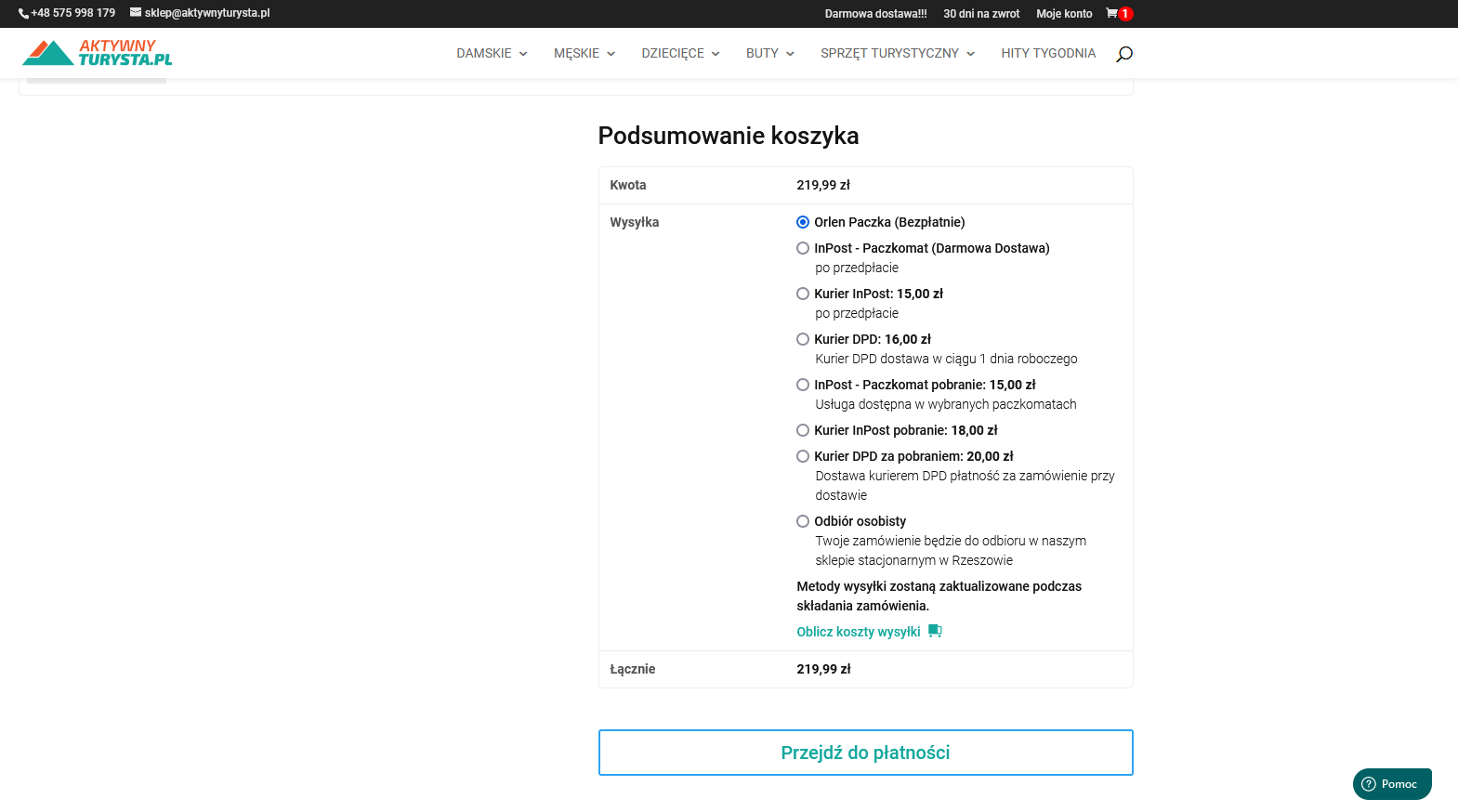
4 Delivery options – checkout in the online store activeturysta.co.uk
The online store should also offer various forms of payment – via BLIK, debit card or paybylink. It is important to guarantee customers the security of transactions, which is ensured, among other things. SSL certificate. When guiding a customer to the payment stage, add a CTA informing about security (e.g., “Proceed to secure checkout”), along with graphic elements – a distinctive padlock icon and a trust icon below it informing about security verification. The CTA button should be at the top of the page and at the bottom (in this case, duplication has a positive effect on encouraging the customer to complete the transaction). If you make an installment purchase available, it is a good idea to show pictures of all available installment methods and information about the number and amount of installments.
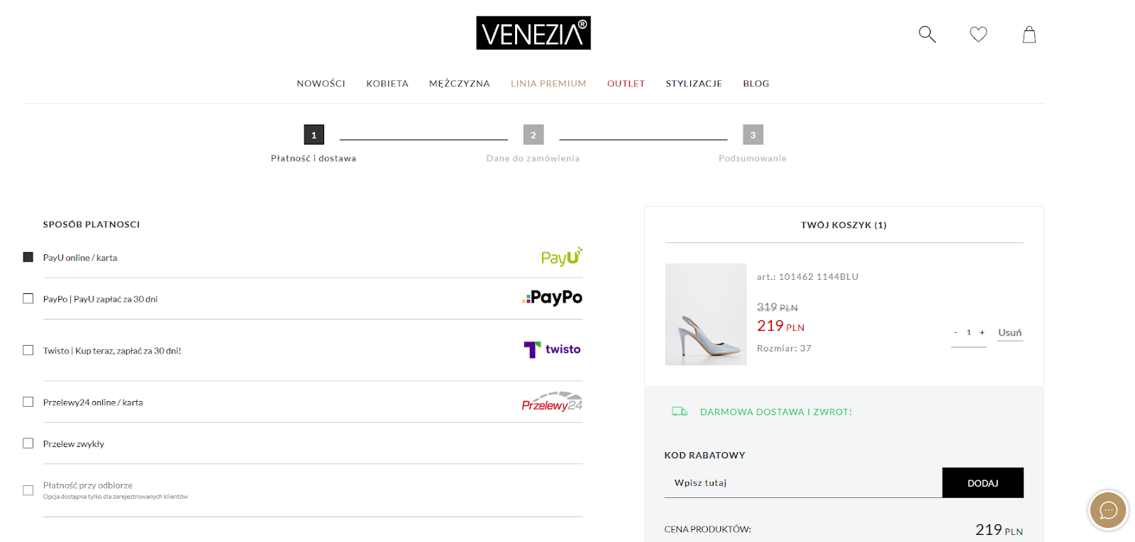
5 Payment options – checkout at venezia.co.uk online store
As you can see, there are really many things to keep in mind when creating a shopping cart. The most important thing is to make all the information clearly visible to the recipient, it is also worth displaying the possibility of easy contact with the customer service office. As for the checkout itself, the store should make sure that it is simplified as much as possible. This will reduce abandoned shopping carts.