
Any goal you want to achieve with your website – whether to make sales, acquire leads or anything else, requires an efficient way to guide the customer through the website. This is where CTA comes in handy. If you are wondering CTA – what is it? This article clarifies this issue and suggests solutions, worth applying, to lead the customer to perform exactly the action you want.
CTA – what is it?
CTA is a very important concept in online marketing, especially in e-commerce. Call to Action, or call to action. Describes all the elements to encourage or even compel a website user to perform a specific action. They are most often used in the form of buttons, images or text links, strongly standing out from the entire page.
Where and how is CTA applied?
A CTA is something like a summary of the information the user has received and directs him to perform an action. The simplest and most commonly used calls to action are “Buy now,” “Order,” “Download,” ” Learn more.” Places where you are sure to encounter CTAs:
- webshops
- websites
- landing page
- emails
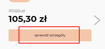
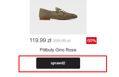
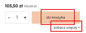

Examples of CTAs. Source: Internet
Basic assumptions related to CTA
- The main CTA is the most visible element on the product page.
- The main CTA in the store includes a “shopping cart” icon.
- The CTA copy clearly explains what will happen when you click on it.
- The background color of the main CTA stands out strongly, or at least differs from the other elements visible on the page.
CTAs directly related to products
- The CTA is tailored for mobile devices, that is, large enough and with enough white space around it to prevent erroneous clicks.
- The product variant selection is linked to the product gallery and shows pictures of the selected product variants. A visible reminder to select a product variant appears if a customer forgets and clicks “add to cart” too soon.
- The size chart (or a link that opens in a small window and is easy to close on mobile devices) is located near the size selection (for products of different sizes).
CTAs related to price, payment and shipping
- The product price is sufficiently visible and located near the main CTA.
- All additional charges that may arise (such as choosing a larger size) are shown near the main CTA are shown.
- If free shipping is offered, it is highlighted near the main CTA.
- All shipping information (cost, time, delivery options) is visible at the main CTA.
- Product availability is shown next to the main CTA (e.g., “In stock”)
- Payment options that are commonly used (e.g. PayPal, Amazon, Google Pay, Apple Pay) are shown and available.
- The possibility of paying by installments (e.g., Klarna; especially for
expensive products).
Summary
CTAs need to be used because they realistically increase conversions. Customers need an indication of a simple path that will lead them to a satisfactory purchase or contact with the company. Need help creating an online store that sells? Or a good landing page for a specific action in your company? I am at your service!