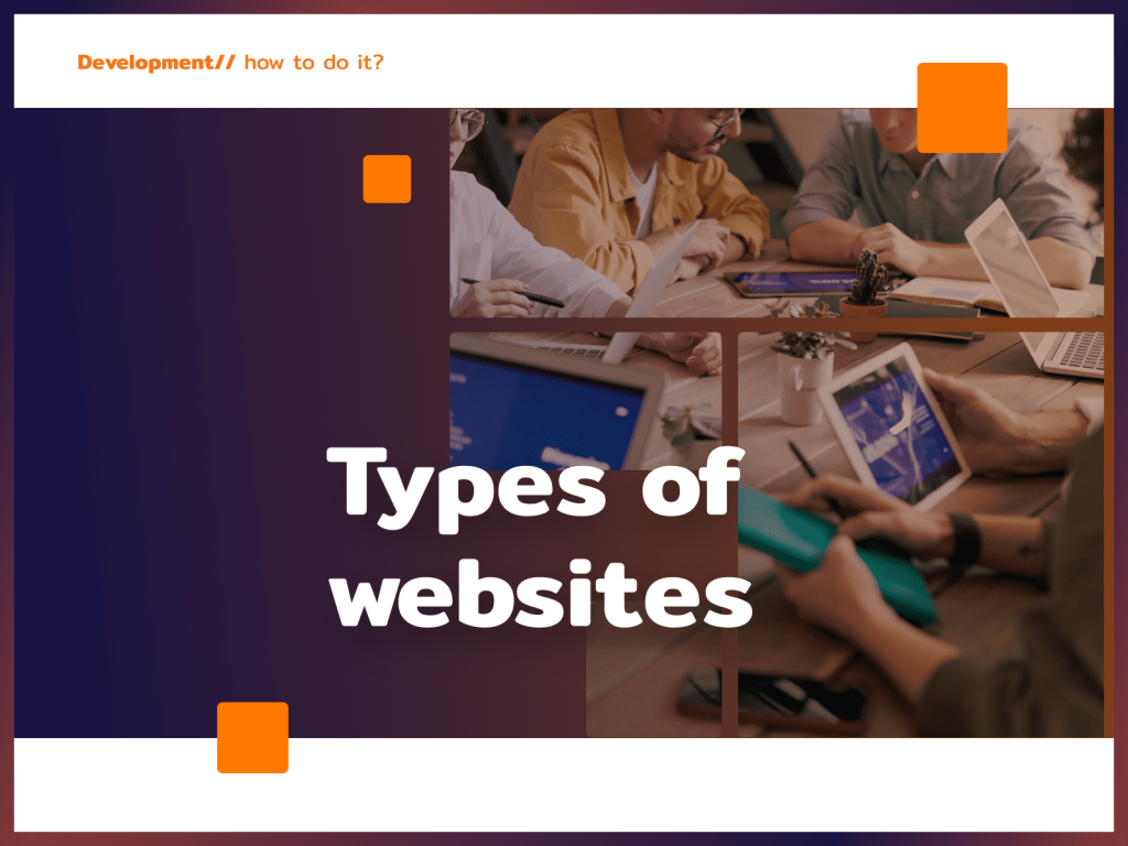
What distinguishes the good side from the bad side? First and foremost is how the user evaluates it. Of course, there are no solutions that will appeal to everyone, but following good practices when it comes to website design certainly won’t hurt. See some of the elements that the vast majority of users pay attention to.
1. domain name
First, the domain name. In my case, it’s simply my last name and first name: zielinskijerzy.com. The vast majority of companies put their name in the domain, this is a good and logical solution, because it helps build brand awareness, and customers, no matter what route they take to you, will associate you with a particular name. However, it happens that the domain with your brand name is already taken. What then?
Instead of yourfirma.com, you can always check yourfirma.pl, yourfirma.com.pl, yourfirma.net or your-firma.com addresses. Remember, however, that the simpler the name of your site, the better, so don’t overcomplicate things. It is possible to buy a domain with extensions such as .design or .business, but Polish users are not used to them, so the site may inspire less trust, plus the address is harder to remember.
The best domain names consist of 1 or 2 words. Will it be easier to remember the domain advocat-jawor.co.uk or poradyprawne-adwokatjawor.co.uk? The answer is rather simple.
Also pay attention to whether the domain name is easy, for example, to dictate over the phone. If you have to spell it out for the interviewer to understand you, reconsider your choice. A person who hears from a friend that she bought a nice pair of shoes on your website is also unlikely to remember the domain and type it correctly into a search engine.
2 CTA buttons
They talk about Call to Action to the point of boredom, but they really are essential on the site. Graphically highlighted calls to action (e.g., Buy Now, Subscribe, Contact) make it so that, most simply, the user knows where to click. The easier it is for him to navigate the site, the more likely he is to sign up for a newsletter, make a purchase, etc.
The CTA button should immediately catch the eye:
3 Responsiveness
Another issue that is talked about practically constantly, and yet it still happens that sites “crash” on mobile devices. The mere fact that the template in theory is responsive and the site displays on a smartphone is only the first step to success. The site should be comfortable and intuitive to use, at any resolution. That’s why a growing number of specialists are finding that web design with a mobile first approach is the best solution. This means that the creation of a page starts with the device with the smallest resolution, not the largest.
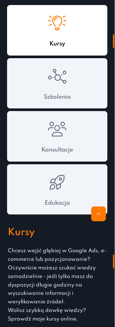
For comparison, the same section on my site in the desktop and mobile versions:
4. content and design of the site
I know that website design is a very general term. This is primarily about what we see at first glance: color scheme, headlines, font, graphics. Above all, they should be consistent with the character of your brand.
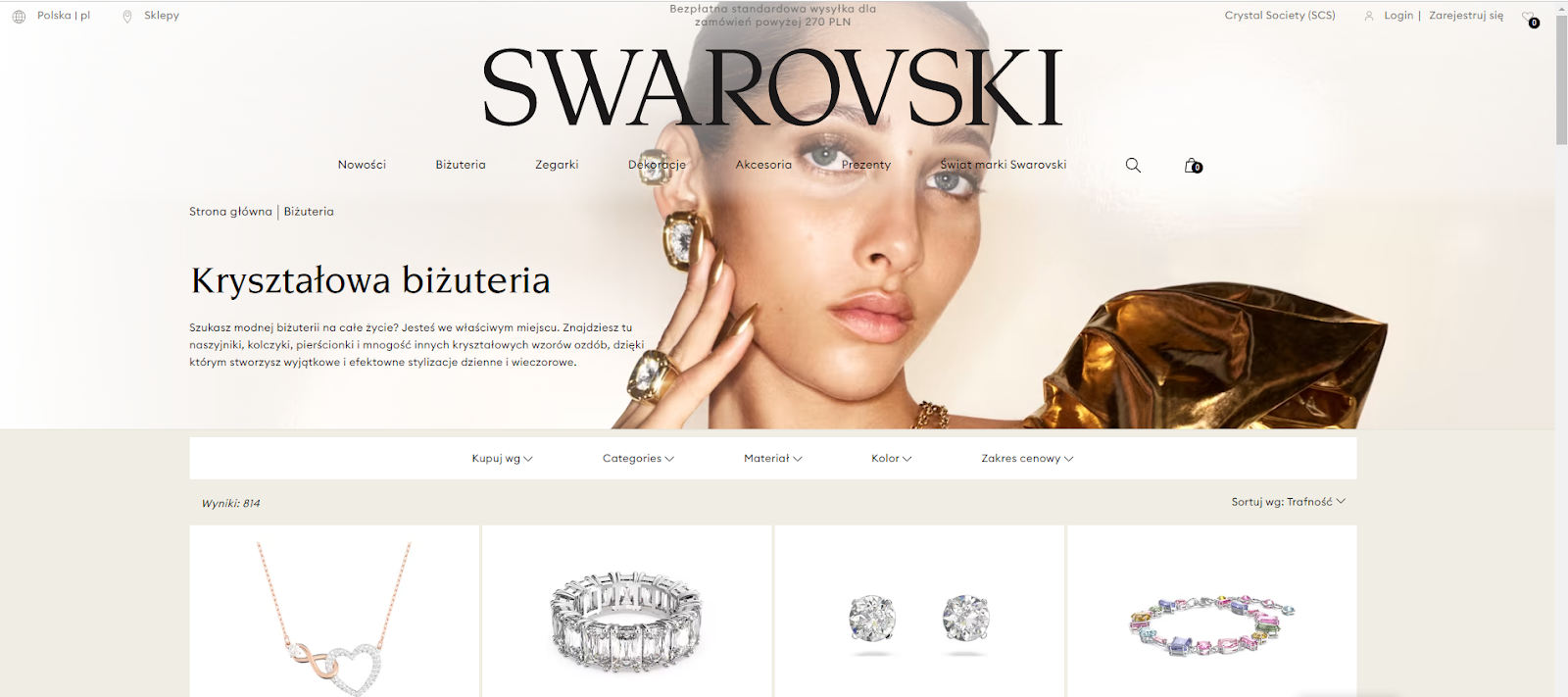
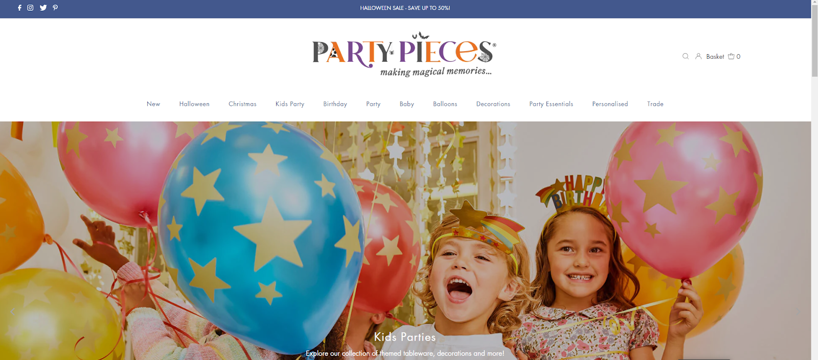
Other emotions are to be stirred up by the jewelry page, and others by the party decorations:
The quality of the graphics is also worth keeping in mind. I’m not just talking about keeping them sharp, but also about their selection. It’s a good idea to show your team, your company headquarters, your product development process. In this way, you will inspire more confidence in the customer than relying solely on free graphics from Stock. Sometimes you can find practically the same photos on several sites from the same industry – it’s going for the lowest line of resistance, but this way you won’t stand out.
5. text formatting
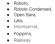
Text is one thing – ideally it should be engaging, easy to read and, of course, linguistically correct. What matters, however, is not only what you write, but also how. Website design also includes choosing the right fonts. Such fonts as:
A font that mimics handwriting is an interesting variation, but legibility should come first. I also do not recommend using fonts smaller than 14 pixels.
It is useful to use formatting in the text: Bold key information, bullets, paragraphs. Also, don’t forget the headlines – Are important not only from an SEO perspective. Let’s not kid ourselves, many users don’t read all the text on a page, they just scan it with their eyes. There is a greater chance that someone will skim through the headlines than read the entire content.
There is no single proven method for creating an effective site, because every brand is different. What works for one company will be a shot in the foot for another. Would you like me to take an individual look at your company’s online image and give you specific tips? Contact me!